In this vignette we will recreate Figure 2B from Matsushita & Nishimura (2020)1 which was made in GraphPad Prism 7.
The authors of this paper mutate trehalose synthesis enzyme (Tps1) in fruit flies and then observe the effect of this mutation on their wings. Figure 2B, shown below, shows the percentage change in three fly wing attributes in homozygous Tps1 mutants compared to heterozygous Tps1 mutants. The data are separated according to the sex of the fly.
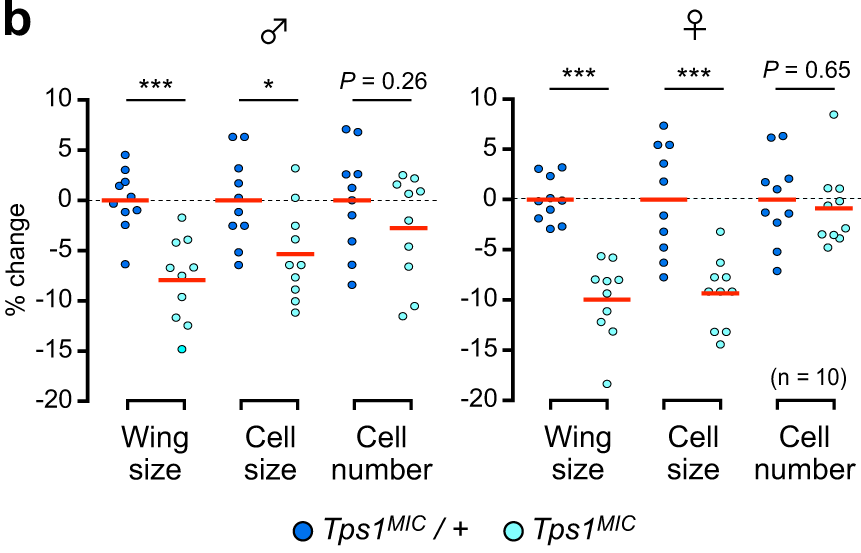
The raw data underlying Figure 2B is accessible in the article’s
Supplementary Data. For ease of use, this small data set (aptly named
wings) has been ‘tidied’ and is provided with the
ggprism package.
Preparation
To recreate this figure we begin with loading the required packages and data set.
library(dplyr)
#>
#> Attaching package: 'dplyr'
#> The following objects are masked from 'package:stats':
#>
#>     filter, lag
#> The following objects are masked from 'package:base':
#>
#>     intersect, setdiff, setequal, union
library(ggplot2)
library(ggprism)
library(ggbeeswarm)
library(rstatix)
#>
#> Attaching package: 'rstatix'
#> The following object is masked from 'package:stats':
#>
#>     filter
data("wings")
head(wings)
#> # A tibble: 6 × 4
#>   sex   genotype  measure     percent.change
#>   <fct> <fct>     <fct>                <dbl>
#> 1 male  Tps1MIC/+ wing.size            -2.45
#> 2 male  Tps1MIC/+ cell.size             6.33
#> 3 male  Tps1MIC/+ cell.number          -8.41
#> 4 male  Tps1MIC/+ wing.size            -1.14
#> 5 male  Tps1MIC/+ cell.size            -2.53
#> 6 male  Tps1MIC/+ cell.number           1.26
The data are already in ‘long format’ so we could just jump straight
to plotting. However, we can see that the text in the
measure column is not in title case so we’ll need to
quickly do some string manipulation.
# substitute period with space, convert to title case, convert back to factor
wings$measure <- wings$measure %>%
  gsub("\\.", " ", .) %>%
  tools::toTitleCase() %>%
  factor(., levels = c("Wing Size", "Cell Size", "Cell Number"))
head(wings)
#> # A tibble: 6 × 4
#>   sex   genotype  measure     percent.change
#>   <fct> <fct>     <fct>                <dbl>
#> 1 male  Tps1MIC/+ Wing Size            -2.45
#> 2 male  Tps1MIC/+ Cell Size             6.33
#> 3 male  Tps1MIC/+ Cell Number          -8.41
#> 4 male  Tps1MIC/+ Wing Size            -1.14
#> 5 male  Tps1MIC/+ Cell Size            -2.53
#> 6 male  Tps1MIC/+ Cell Number           1.26
Adjusting data-related elements
Now we’ll just give the ggplot() function our data.
# plot the wing measurement vs the percentage change compared to
# the heterozygous mutants
p <- ggplot(wings, aes(x = measure, y = percent.change))
First we will plot the individual data points with random jitter
using geom_beeswarm() from the ggbeeswarm
package. The points will look too spaced out here, but don’t worry they
will become more compact in the following step. We will also colour the
points and adjust their horizontal position them by genotype.
# add the data points and fill according to the genotype
p <- p + ggbeeswarm::geom_beeswarm(
  aes(fill = genotype),
  dodge.width = 0.9,
  shape = 21,
  cex = 3.5
)
p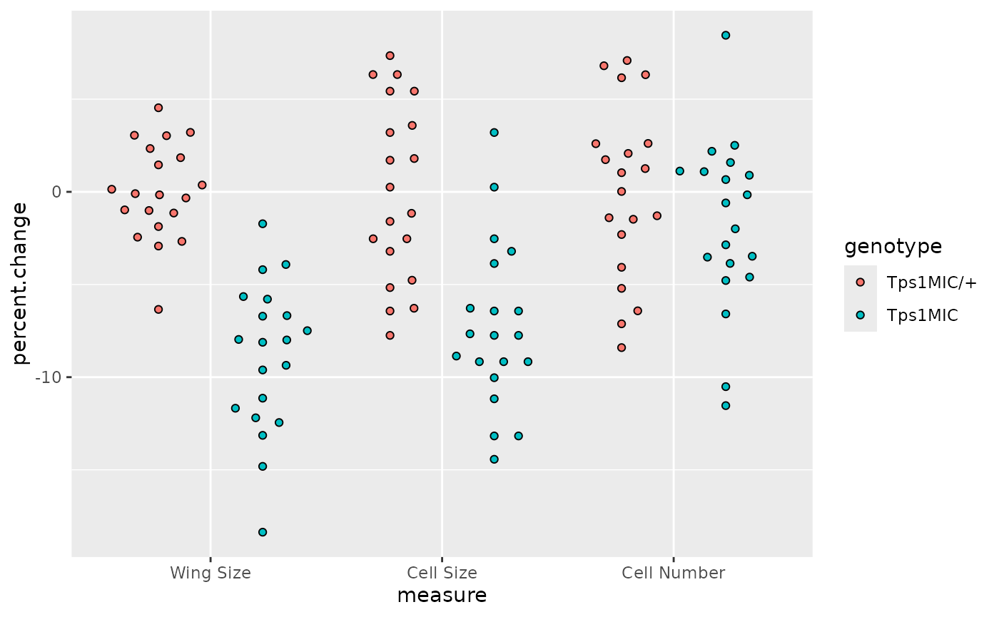
Now we want to separate the points according to sex as in the
original plot. For this we can just use facet_wrap() and
then set the facet titles to the Unicode symbols for male and
female.
# separate data according to fly sex
p <- p + facet_wrap(
    ~ sex,
    scales = "free",
    labeller = labeller(sex = c(male = "\u2642", female = "\u2640"))
  )
p
Overlying the points in the original plot is a horizontal dotted line
at y = 0. This is added to our ggplot using
geom_hline().
# plot a horiztonal line at y = 0 i.e. percentage change = 0
p <- p + geom_hline(yintercept = 0, linetype = 2, linewidth = 0.3)
p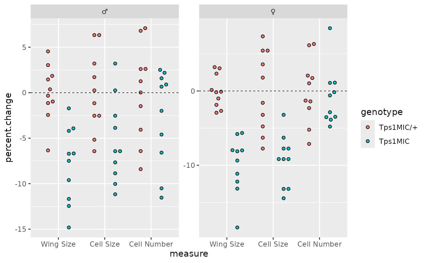
On top of this are red horizontal bars showing the mean value for
each group. These can be added to ggplots using the
stat_summary() function with the
geom_crossbar() Geom.
# plot solid red lines at the mean of each group
p <- p + stat_summary(
    geom = "crossbar",
    aes(fill = genotype),
    fun = mean,
    position = position_dodge(0.9),
    colour = "red",
    linewidth = 0.4, width = 0.7,
    show.legend = FALSE
  )
p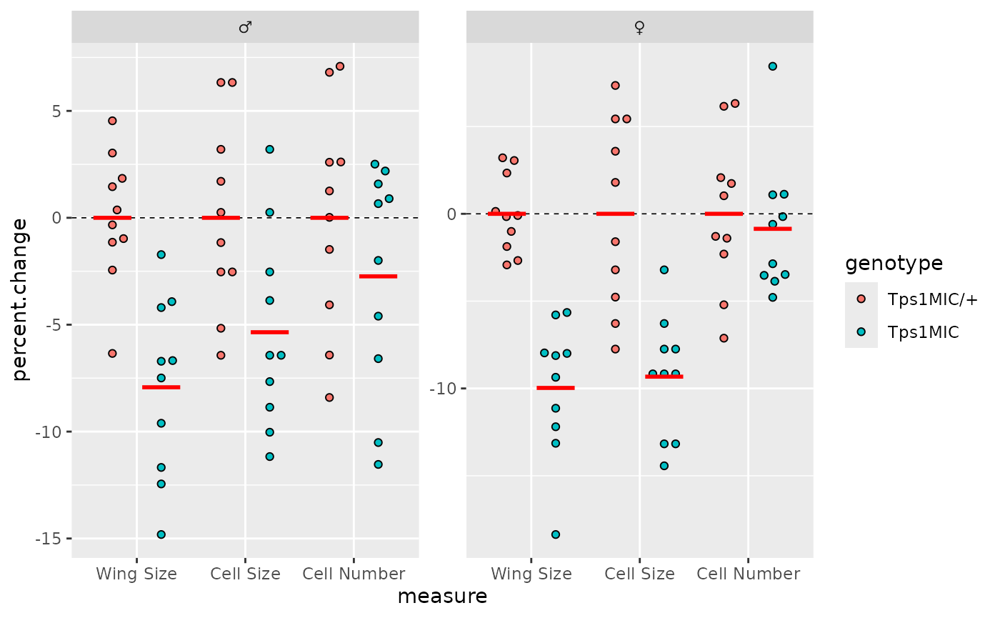
The last data-related element to be added are the p-value brackets.
To do this we need to generate a table of p-values with the correct
format, and then use this table with the add_pvalue()
function from ggprism.
The easiest way to generate the p-value table is with the rstatix
(you could also do it manually but using rstatix ensures
the table is of the correct format). In this case we group the
wings data by sex and wing measure, and then test whether
the percentage change in wing size/cell size/cell number is explained by
the fly genotype. We also use the add_x_position() function
from rstatix to make sure the bracket ends have the correct
x axis positions (specifically the xmin and
xmax columns). Lastly, we manually change the bracket
labels to appear as we would like them to.
# perform t-tests to compare the means of the genotypes for each measure
# and correct the p-values for multiple testing
wings_pvals <- wings %>%
  group_by(sex, measure) %>%
  rstatix::t_test(
    percent.change ~ genotype,
    p.adjust.method = "BH",
    var.equal = TRUE,
    ref.group = "Tps1MIC/+"
  ) %>%
  rstatix::add_x_position(x = "measure", dodge = 0.9) %>% # dodge must match points
  mutate(label = c("***", "*", "P = 0.26", "***", "***", "P = 0.65"))

wings_pvals
#> # A tibble: 6 × 14
#>   sex    measure   .y.   group1 group2    n1    n2 statistic    df       p     x
#>   <fct>  <fct>     <chr> <chr>  <chr>  <int> <int>     <dbl> <dbl>   <dbl> <dbl>
#> 1 male   Wing Size perc… Tps1M… Tps1M…    10    10     4.85     18 1.29e-4     1
#> 2 male   Cell Size perc… Tps1M… Tps1M…    10    10     2.65     18 1.61e-2     2
#> 3 male   Cell Num… perc… Tps1M… Tps1M…    10    10     1.17     18 2.58e-1     3
#> 4 female Wing Size perc… Tps1M… Tps1M…    10    10     7.05     18 1.41e-6     1
#> 5 female Cell Size perc… Tps1M… Tps1M…    10    10     4.59     18 2.28e-4     2
#> 6 female Cell Num… perc… Tps1M… Tps1M…    10    10     0.463    18 6.49e-1     3
#> # ℹ 3 more variables: xmin <dbl>, xmax <dbl>, label <chr>
With this p-value table, we can now add p-value brackets.
# plot the p-values with brackets for each comparison
p <- p + add_pvalue(
    wings_pvals, y = 10, xmin = "xmin", xmax = "xmax", tip.length = 0,
    fontface = "italic", lineend = "round", bracket.size = 0.5
  )
p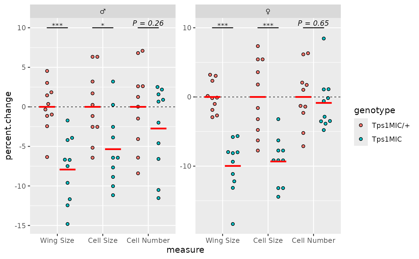
Adjusting theme elements
With the data-related elements in place we can turn to changing the
overall plot theme and appearance. First, we’ll apply
theme_prism(). By default the theme uses all bold font so
we set base_fontface = "plain" so that all text is of
normal weight.
# apply theme_prism()
p <- p + theme_prism(
  base_fontface = "plain",
  base_line_size = 0.7,
  base_family = "Arial"
)
p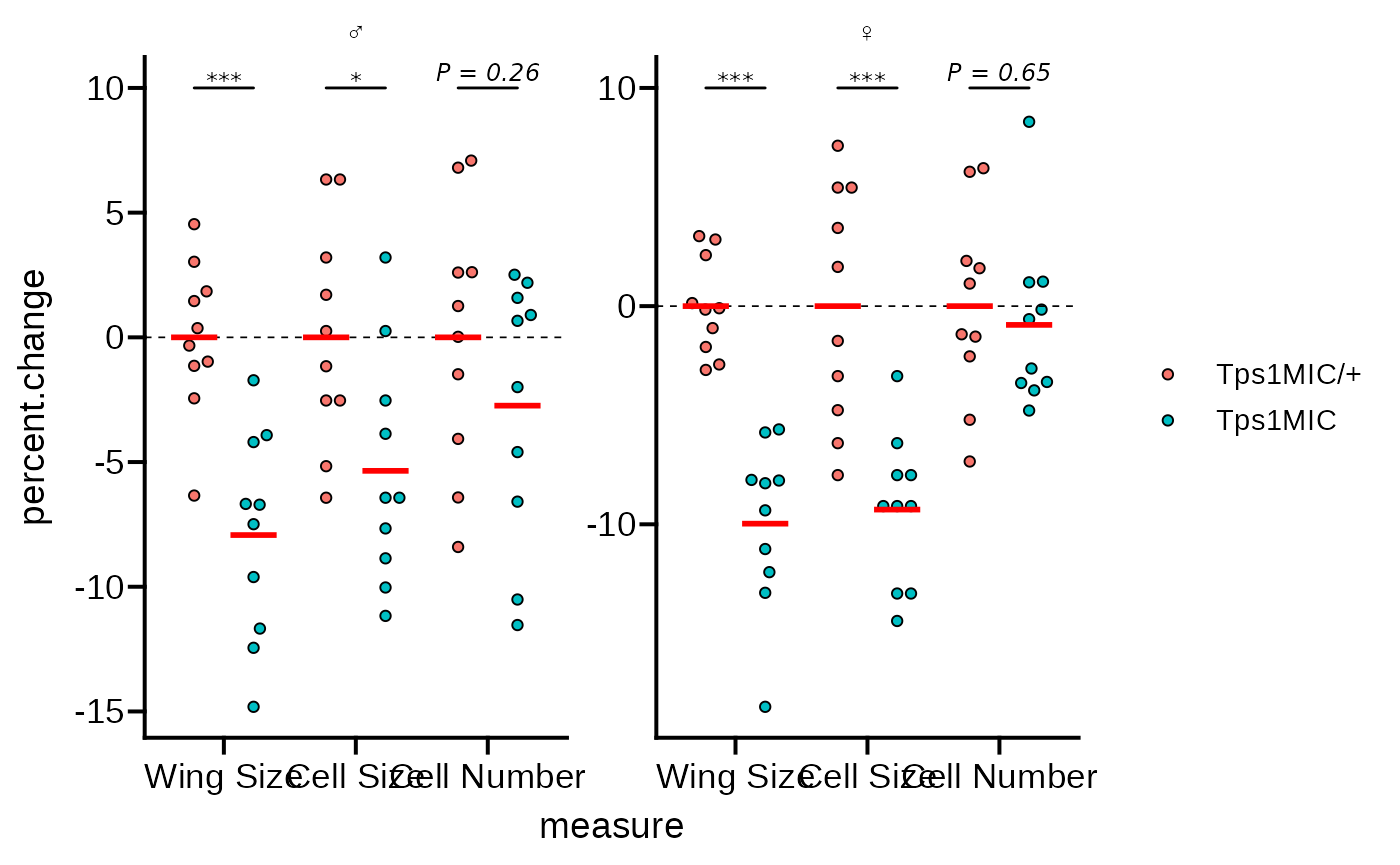
We’ll need to fix the x axes text as the labels are overlapping, and
the axes use brackets instead of a line. We can fix the labels using
line breaks as in the original plot, and also set the axes guides to
guide_prism_bracket().
# change the x axis to brackets and add line breaks to the axis text
p <- p + scale_x_discrete(
    guide = guide_prism_bracket(width = 0.15),
    labels = scales::wrap_format(5)
  )
p
#> Warning: The S3 guide system was deprecated in ggplot2 3.5.0.
#> ℹ It has been replaced by a ggproto system that can be extended.
#> This warning is displayed once every 8 hours.
#> Call `lifecycle::last_lifecycle_warnings()` to see where this warning was
#> generated.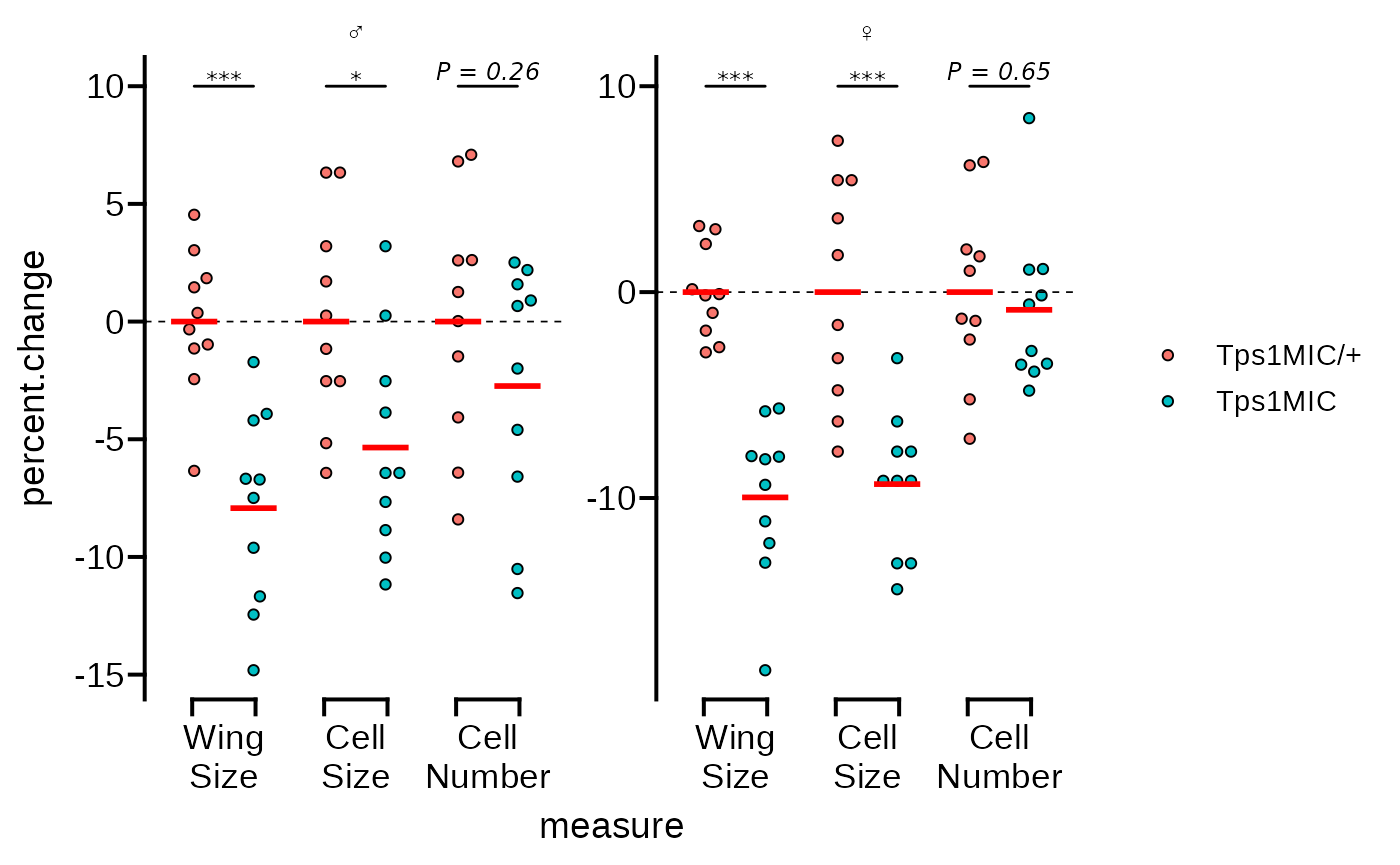
Now we’ll fix the y axes so that they are identical as in the
original Figure 2B. We’ll also apply the
guide_prism_offset() guide so the axis line doesn’t extend
beyond the outermost tick marks. Additionally, we’ll adjust the y axis
title.
# adjust the y axis limits and change the style to 'offset'
p <- p + scale_y_continuous(
limits = c(-20, 12),
expand = c(0, 0),
breaks = seq(-20, 10, 5),
guide = "prism_offset"
) +
labs(y = "% change")
p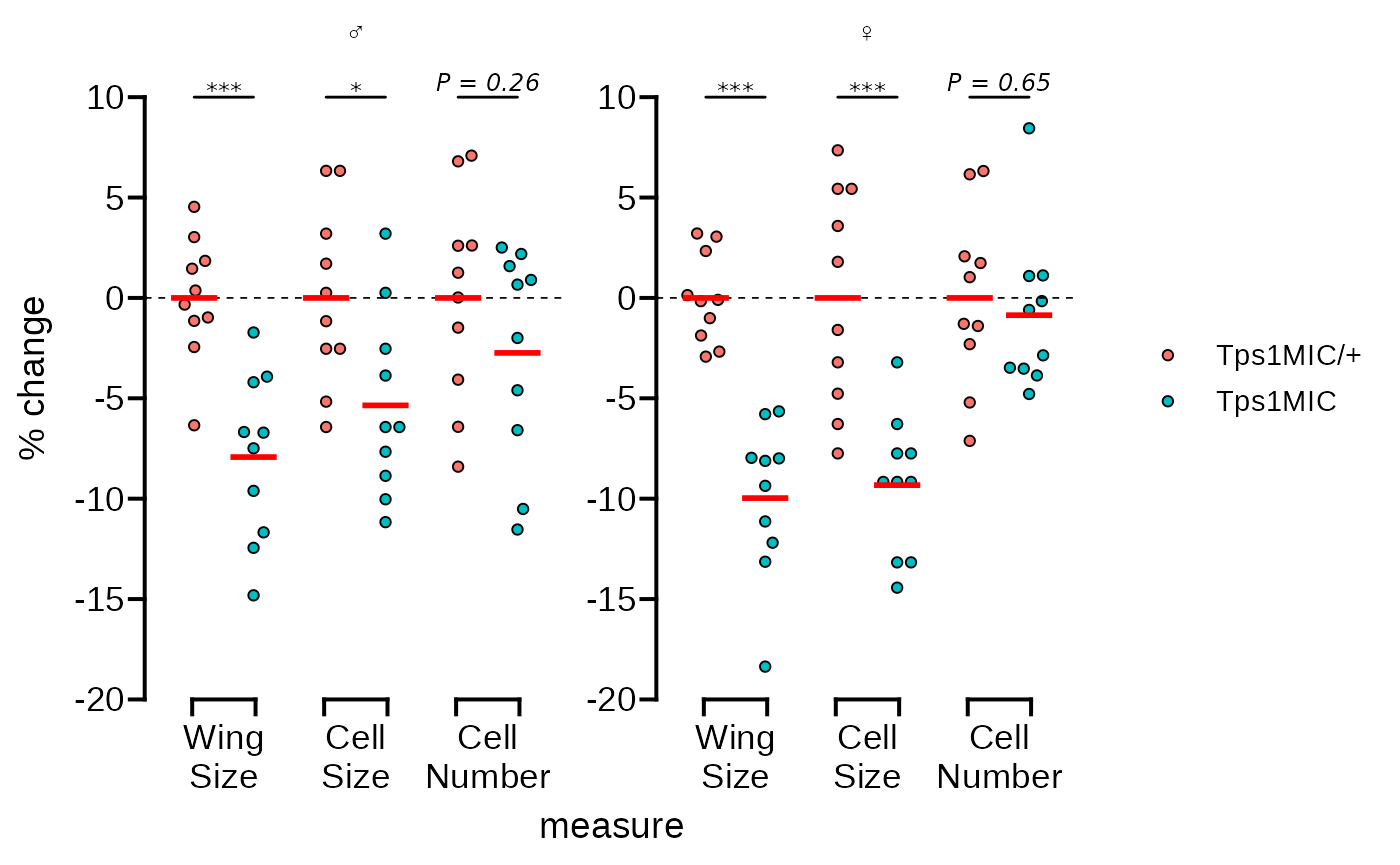 The plot is already looking good as is. But the goal of this vignette is
to recreate the original as closely as possible, so we will continue
with some minor adjustments.
The plot is already looking good as is. But the goal of this vignette is
to recreate the original as closely as possible, so we will continue
with some minor adjustments.
We need to use scale_fill_manual() to change the point
fills to match. We’ll also fix the formatting of the legend text in this
step.
# change the point fill and adjust the legend text formatting
p <- p + scale_fill_manual(
    values = c("#026FEE", "#87FFFF"),
    labels = c(expression("Tps"*1^italic("MIC")~"/ +"),
               expression("Tps"*1^italic("MIC")))
  )
p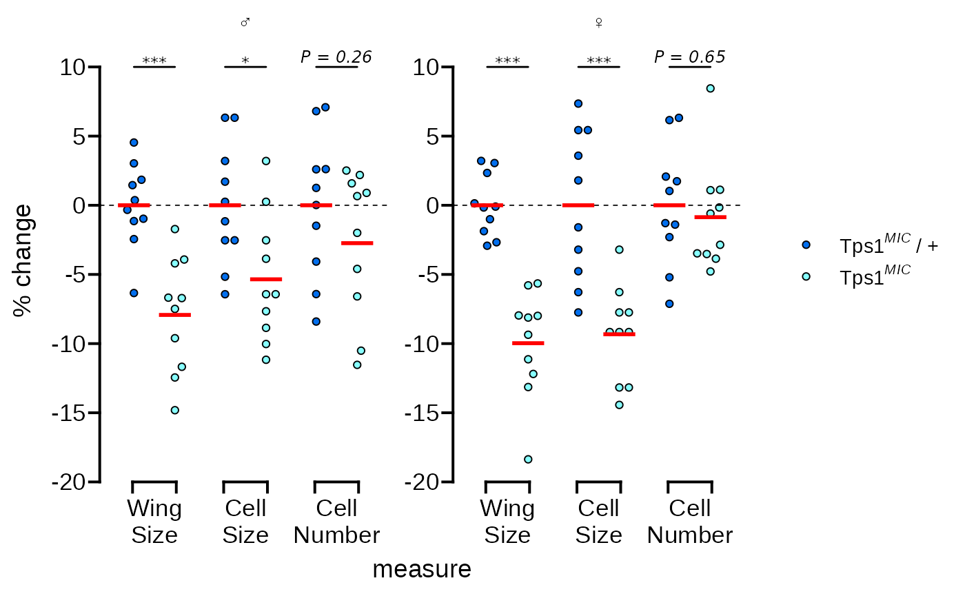
Next we’ll do a few things at once in one call of the
theme() function:
- Move the legend below the plot
- Remove the x axis title
- Make the male and female symbols larger
- Make the legend more compact
- Reduce the space between the legend symbols and the legend text
p <- p + theme(
    legend.position = "bottom",
    axis.title.x = element_blank(),
    strip.text = element_text(size = 14),
    legend.spacing.x = unit(0, "pt"),
    legend.text = element_text(margin = margin(r = 20))
  )
p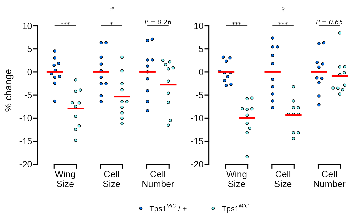
The original graph also has a label with the number of replicates in the bottom right corner of the plotting area. This is a little tricky to do with facets and requires creating a dummy data.frame to get the positioning correct.
# add n = 10 as a text annotation
p <- p + geom_text(
    data = data.frame(
      sex = factor("female", levels = c("male", "female")),
      measure = "Cell Number",
      percent.change = -18.5,
      lab = "(n = 10)"
    ),
    aes(label = lab)
  )
p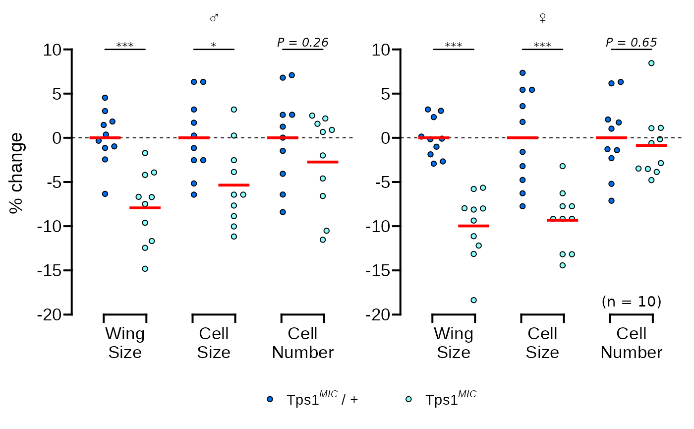
The final thing to do is just make the legend symbols a bit larger
using the overrride.aes argument in
guide_legend().
# make the points larger in the legend only
p <- p + guides(fill = guide_legend(override.aes = list(size = 3)))
p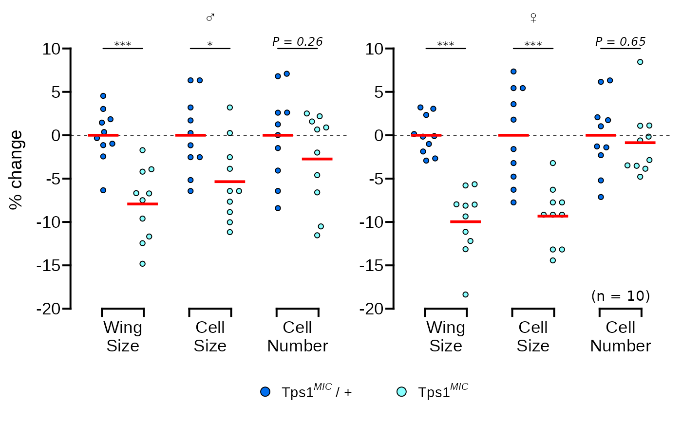
And that’s it! Our ggplot graph is almost identical to the original.
Plot source code
Here is the complete code for the plot.
wings_pvals <- wings %>%
  group_by(sex, measure) %>%
  rstatix::t_test(
    percent.change ~ genotype,
    p.adjust.method = "BH",
    var.equal = TRUE,
    ref.group = "Tps1MIC/+"
  ) %>%
  rstatix::add_x_position(x = "measure", dodge = 0.9) %>% # dodge must match points
  mutate(label = c("***", "*", "P = 0.26", "***", "***", "P = 0.65"))

ggplot(wings, aes(x = measure, y = percent.change)) +
  ggbeeswarm::geom_beeswarm(aes(fill = genotype), dodge.width = 0.9, shape = 21) +
  facet_wrap(~ sex, scales = "free",
    labeller = labeller(sex = c(male = "\u2642", female = "\u2640"))) +
  geom_hline(yintercept = 0, linetype = 2, linewidth = 0.3) +
  stat_summary(geom = "crossbar", aes(fill = genotype),fun = mean,
    position = position_dodge(0.9), colour = "red", linewidth = 0.4, width = 0.7,
    show.legend = FALSE) +
   add_pvalue(wings_pvals, y = 10, xmin = "xmin", xmax = "xmax",
              tip.length = 0, fontface = "italic",
              lineend = "round", bracket.size = 0.5) +
  theme_prism(base_fontface = "plain", base_line_size = 0.7,
              base_family = "Arial") +
  scale_x_discrete(guide = guide_prism_bracket(width = 0.15),
                   labels = scales::wrap_format(5)) +
  scale_y_continuous(limits = c(-20, 12), expand = c(0, 0),
    breaks = seq(-20, 10, 5), guide = "prism_offset") +
  labs(y = "% change") +
  scale_fill_manual(values = c("#026FEE", "#87FFFF"),
    labels = c(expression("Tps"*1^italic("MIC")~"/ +"),
               expression("Tps"*1^italic("MIC")))) +
  theme(legend.position = "bottom",
        axis.title.x = element_blank(),
        strip.text = element_text(size = 14),
        legend.spacing.x = unit(0, "pt"),
        legend.text = element_text(margin = margin(r = 20))) +
  geom_text(data = data.frame(sex = factor("female", levels = c("male", "female")),
                              measure = "Cell Number",
                              percent.change = -18.5,
                              lab = "(n = 10)"),
            aes(label = lab)) +
  guides(fill = guide_legend(override.aes = list(size = 3)))
Matsushita, R., Nishimura, T. Trehalose metabolism confers developmental robustness and stability in Drosophila by regulating glucose homeostasis. Commun Biol 3, 170 (2020). https://doi.org/10.1038/s42003-020-0889-1↩︎